Café X: By Any Beans Necessary

Role: Visual Design, Branding
Timeline: 3 Months (June 2021- August 2021)
Scope: UX Design, UX Research, UI Design, Visual Design, Marketing & Branding

My Team: Francesco Medina, Minnie Chau, Shad Reyes, Camille Yabut, Nathen Shin
My Mentors: Eric Richards, Jean Ly, Joanna Lam
The Situation
Over the course of a 10-week program called PowerUp, my team worked with Café X, a BIPOC and women owned business seeking to refine their branding, redesign their website, and boost their exposure.
My Contributions
UI Design
Visual Design
Branding

Our client’s main goals for us were three deliverables...

How might we best equip Café X to increase customer awareness, acquisition, and retention in their physical and online space?

Café X: By Any Beans Necessary is a family-owned, Black woman-owned co-operative (shortened as co-op) coffee shop built to support generational wealth building in the Black community and other marginalized communities. We do this by developing cross-sector partnerships with community-based organizations and individuals; sustaining creative and artistic projects; and developing the next generation of leaders to generate a social, cultural, and economic movement that changes the quality of life in our communities - one cup at a time.
Who Is Cafe X?
As the visual designer, I worked closely with both the creative team for UI design, and overall design assistance, as well as the marketing team with branding redesign. 
My Role

Who do you want to be?

To begin with, I started with an analysis of Cafe X’s current brand image, talking with the owners, Cynthia and Khea, and their customers to better understand how they wanted their brand to be perceived and the steps we could take to push those elements forward for consumers, investors, and other brands. 

Cynthia and Khea explained their mission and overall values that helped cement a target audience and pain points. I also focused on pulling tone words that best suited their identity and could drive their rebrand.

In their own words, "these values underlie the 'how,' 'where,' and 'with whom,' we do our work.".

Mission Statement


"INTEGRITY FROM THE ROOT.

CREATIVE COLLABORATIONS.

QUALITY THROUGH CARE.

CONNECTED COMMUNITY.

AUTHENTICITY ALWAYS.”

Ages 18-25, Younger Crowd, Gen Z
Target Audience
Tone Words

Expressive
Empowering
Black-Owned
Authentic
Community-Driven

Understanding the Current Environment

I did a holistic overview of their branding through their online presence such as their website and social media channels, finding some problems that prevented them from aligning with their values, such as bright, clashing colors.

I also completed a competitive analysis of competing coffee shops to better understand how to help Cafe X stand out from the crowd and reach their intended audience. I then iterated on a brand identity that spoke to Cafe X’s core values. 

Iterating

I created two guiding tones that would shape the overall design image, each speaking to different facets of the values Cynthia and Khea mentioned. 

Bold 

  • Aligned with tone words: 
    Expressive, Empowering, Black-Owned

Neutral 

  • Aligned with tone words: 
    Authentic, Community-Driven

Moodboards created for both palettes

After consulting with our clients, customers, mentors, and of course the rest of the team, I compiled their feedback to create the final brand identity.

Final Guide

My final brand identity that I created for Cafe X consisted of a revised dynamic color system, typeface and sizing, as well as assets and elements that spoke to who they were as a brand. 

The clients as well as the team felt both of the previous iterations each had their individual strengths that could better represent the brand if they were combined. So, I created a hybrid style guide of both.  

With a base of neutrals to pull from and ground the visual identity, I also included three accent colors, burnt orange, royal blue, and forest green that created bright pops of color.
Color System
The primary typography used throughout is Helvetica Neue, a cleaner and easily understood sans-serif font that allows for information and content to be the primary focus, while still providing a bold and strong visual foundation that matches with the "empowering" tone word. The secondary font is Junicode, a serif that lends a more elegant, classic, and homey feel, allowing the "expressive" tone word to be carried out visually. It is used for any accent text or descriptions to add an air of authenticity.
Fonts & Typefaces
The design assets and elements were models after flat geometric, abstract shapes and a linear design style.
Assets & Design Elements

Deliverables

Once the rebrand was complete, it was deployed across the rest of the final deliverables for Cafe X, including web UI, social media, and marketing. 

I helped develop the high fidelity prototype of Cafe X’s website and e-commerce pages alongside UX design. The style guide for their website was developed from our core style guide. Bright pops of orange, were used for the call-to-action (CTA) buttons to highlight important information on the website. The burnt orange tone was complemented by neutral tones.
Web UI

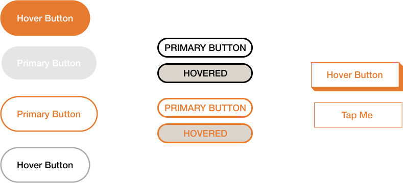
CTA button color iterations

CTA button design iterations

I made several social media templates for Cafe X to use on their Instagram, the main social media platform they had wanted to prioritize. This included post templates, story templates, as well as design elements and general guidelines on how to reformat the guidelines to their needs. 
Social Media

Example template posts for product launches, community events, and publication blasts

Different color blocks could be used for posts depending on which color system best suited the content.

Dynamic gradients could also be used for announcements as Café X saw fit.

Design iterations for Café X's instagram story highlight covers

Final cover designs

One of the main goals for Cynthia and Khea was the relaunch of their store’s physical space during post-COVID times. I created physical marketing assets they could use to help streamline the process such as business cards as well as physical signage. These were utilized in their grand reopening to help establish their refreshed brand identity and entice and retain new customers. 
Marketing

Reflections

This was the first design project I had working with clients and outside of hypotheticals. There were tangible deliverables that my team and I were able to execute and feedback that we worked with in real time.

Over the course of the project I learned about aligning my design work with client values and how to make design justifications and decisions backed by business and customer goals.

There were limitations on the handoff of all of our work and we had to work with what was possible within our timeframe and abilities. I definitely learned how to scale back and keep decisions simple and effective.

Interdisciplinary work! We were split into two teams, design and marketing. This was my first time working closely with marketing folk and I learned about what important factors they look for when creating an actionable plan for clients and how design can be used to facilitate that. 

If you'd like to read more about the project....

Full Case Study
"Power Up was an amazing experience for Café X. Meeting the students, getting real tools to manage this aspect of our business and learning tips and tricks along the way — it was all priceless. Each student brought a freshness to the table that helped us grow and allowed us to focus on the other aspects of our business that needed attention. We are forever grateful for the time and talent poured into us!

Team, we are so grateful for you. For choosing to do Power Up and for supporting us, our mission and vision. We cherish your contributions and your insight. This is truly what solidarity looks like in practice. We can’t wait to honor you all at the Café!"

-Khea & Cynthia
Client Feedback
"You guys did a great job of not only thinking about the customer journey, where they can find Café X, what they might be interested in about Café X, but also you flipped it on its head and thought about the business owners and how they would tactically approach executing all of these things."
- Jean Ly

"I loved the user research process and how it provided justification for the design decisions you all made. I also want to give the team props for how well prepared the team was [throughout the project]"
- Eric Richards

"It was great working with you guys, everyone had great ideas and it was encouraging to see how collaborative and resourceful everyone was and how everyone worked together so well."
- Joanna Lam
Mentor Feedback